
Finding your way around
The side menu
The dark menu on the left is grouped into sections: Catalog (products, contacts), Transactions (sales, purchases, gift cards), Inventory (stock, repairs), Finance (expenses, accounts, reports) and Administration (users, import/export, integrations, settings). Click a heading to open its sub-menu.
- The arrow at the top collapses the menu to icons, for more room; click it again to expand.
- Your business name and your branch are shown at the bottom.
- The menu shows only what you can open: pages your role doesn't allow, and modules your plan doesn't include, are hidden. See Permissions and plans.
The top bar
| Item | What it does |
|---|---|
| Breadcrumb | Where you are, e.g. Dashboard / Products / Add Product. Click a part to go back to it. |
| POS Screen | Opens the POS in a new tab. The dot is green while your register is open. |
| عربي / EN | Switches language. |
| Bell | Your notifications; a number shows how many are unread. |
| Your name | Your role, My Profile and Sign Out. |
Empty lists
When a table has no items or no matches for the filters, it shows a pale icon and a centred message. Catalog, contact, transaction, stock, expense and report tables share this layout, with an icon relevant to the page.
Messages
- A green bar confirms a change was saved; a red one says something went wrong; an amber one is a warning (the change was saved, but check something). Close them with ×.
- An announcement from ekPOS — for example planned maintenance — may appear as a coloured banner across the top. Some can be dismissed with ×.
Lists
Lists across ekPOS work the same way:
- Search box at the top left.
- Filters in a panel above the table, ready as soon as the page opens. Results update automatically two seconds after your last change, even while a control has focus, so you can choose several filters together. Each changed filter restarts that delay. The main controls stay on one row on desktop; the arrow button (More Filters on hover) adds rows below it.
- Applied filters appear as removable chips. Clear Filters appears when you change the page’s default filters; it restores those defaults without changing the sort or rows per page. A slim bar at the bottom shows pending changes and loading. Hover over it to reveal the × button, which cancels the pending changes; on touch screens the button is visible.
- Date Range opens a popup with presets and custom start/end dates. Lists start at This Financial Year; reports start at This Month. Last Financial Year uses your business’s financial-year start.
- Rows Per Page starts at the value saved in Business Settings. You can override it on a table; reports also offer Show All.
- Results update without reloading the page. Wait for an open selection or complete a custom date range; if an update fails, use Try Again.
- Sort by clicking a column heading marked ↕ (click again to reverse).
- Per page — 25, 50, 100 and more.
- Eye icon — opens the record's details in a panel without leaving the list.
- ⋮ menu — actions for that row: edit, print, delete and more.
- Tick boxes — select rows for a bulk action; a bar appears with what you can do to all of them.
Forms
- Required fields are marked with a red *.
- Many forms check values as you leave a field — a SKU or phone number already in use, for example — and tell you straight away.
- The Save bar stays at the bottom of long forms.
- Deleting asks for confirmation first.
Notifications
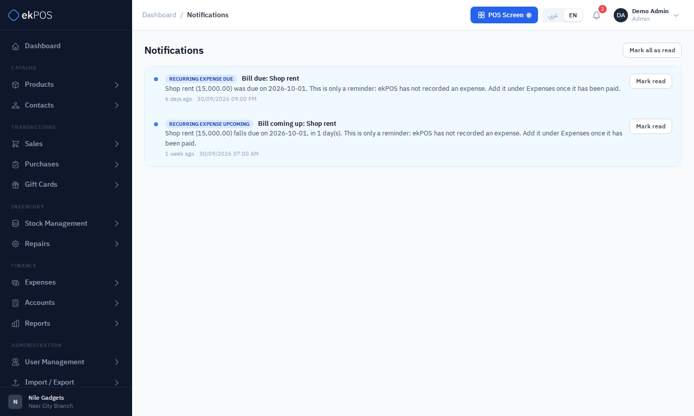
The bell collects messages meant for you: a repair ready for pickup or overdue, a new WooCommerce order, or notice that ekPOS support accessed your account. Click one to mark it read, or Mark all as read. View all opens the full list.
The user guide
This guide needs no sign-in, so you can send any page of it to a colleague. The REST API reference for developers is not public; it opens from Integrations → API for people who may manage integrations.